FAIR WARNING: Ramble ahead!
Everyone has things that they are afraid of. But there are levels to this.
My “fears” aren’t really things that I’m scared of per se – I’m generally not shaking and weeping (although see below) – but more stuff that just makes me feel deeply uncomfortable. But honestly, that’s probably enough at my age to warrant me simply choosing to avoid them, rather than put myself in those sort of positions. I’ve got nothing to prove here.
And, I have to say, I’m completely at peace with that approach.
Well, almost.
Because there’s still a bit of me that thinks that I’m being a bit silly in being uncomfortable about these things. And that if I feel that way, then I should be able to see if I can overcome them and therefore not have to avoid them. I’m not sure that this was a conscious decision, but I seem to have been putting my “mind over matter” skills into play over the last couple of months – and (so far, at least) I’m winning.
Three times now, I’ve put myself to the “mind over matter” test, and come out on top.
I’m not great with heights. I have no real issue with being at a height, but I don’t like getting there or getting down. So I’m generally happy on a ladder, and I’m generally happy on a roof, but getting from one to the other is – for me – absolutely horrific. There have been plenty of occasions when this has been a problem, but the one that sticks in the memory most (not least of my daughter, who watched the whole thing with some bemusement) was at the Cape St Blaize Lighthouse in Mossel Bay, where I lay on the floor at the top for several (or more) minutes… er… shaking and weeping, while simply trying to get onto the ladder to take me down to the floor below.
Obviously, in the end I did do it: this was in September 2022, and I’m not still there.
But it was horrible. And while that was probably the worst example of late, there have been many, many more where I have not been at all happy.
But I am talking myself around, using logic (“How many people have actually fallen here, honestly?”), and this new weird skill I seem to be developing where simply I switch off the outside world and blank everything out. I’ve no idea how it works or if it’s healthy, but in April, I abseiled – forwards, nogal – down a 25m cliff face, using this very method. Looking back at the video of me doing it, it was like watching someone else. And honestly, I don’t remember anything except deciding that I was going to do it and then being unclipped at the bottom.
And of course, I was in absolutely no danger. But then I was in even less danger at the top of the lighthouse, but I couldn’t seem to wrap my head around that at the time. So, heights. Seems a bit silly to me.
Horses, though: different. Fully justified.
I will never ever forget The Juluka Incident Of 2005. A horse (Juluka) (with me on it) galloping out of control through some farmland in Joostenbergvlakte. I genuinely thought that I was going to die, but I stayed on… somehow. Then I had to ride that same horse back to the stables for over and hour – just waiting for him to take off again (he didn’t) – and it was horrible. I went back to the stables there for one more lesson a few days later – because you never end on a bad ride, apparently – and then I stopped riding horses. I haven’t missed it.
And since then, I’ve seen and heard of some nasty falls and injuries from horses. Not me. I’ve been on a horse three times since then. One awful, out of control ride along a beach in Hermanus in 2007 (which I shouldn’t have done, and which left me with bleeding hands from hanging onto the reins so tightly), one gentle walk through the vineyards in Constantia in 2009, which was fine (but I was still very happy to get off at the end), and once on the biggest horse in Africa: 1250kg of Shadowfax in 2022 – but that was walking round a paddock for literally 2 minutes with a groom (Kevin) holding a lead rein. Doesn’t really count.
My wife, meanwhile…
But that’s her indaba.
And then I went for a one-off riding lesson this weekend. Absolutely mind over matter again. We were riding right where I saw someone fall from the same horse and break her arm. And again, I went into that weird state of zoning out from everything except for the teacher’s instruction, and – of course – it was absolutely fine.
Will I be taking up riding again? Hell, no. But look: I got on a horse, despite all the bad horse stuff.
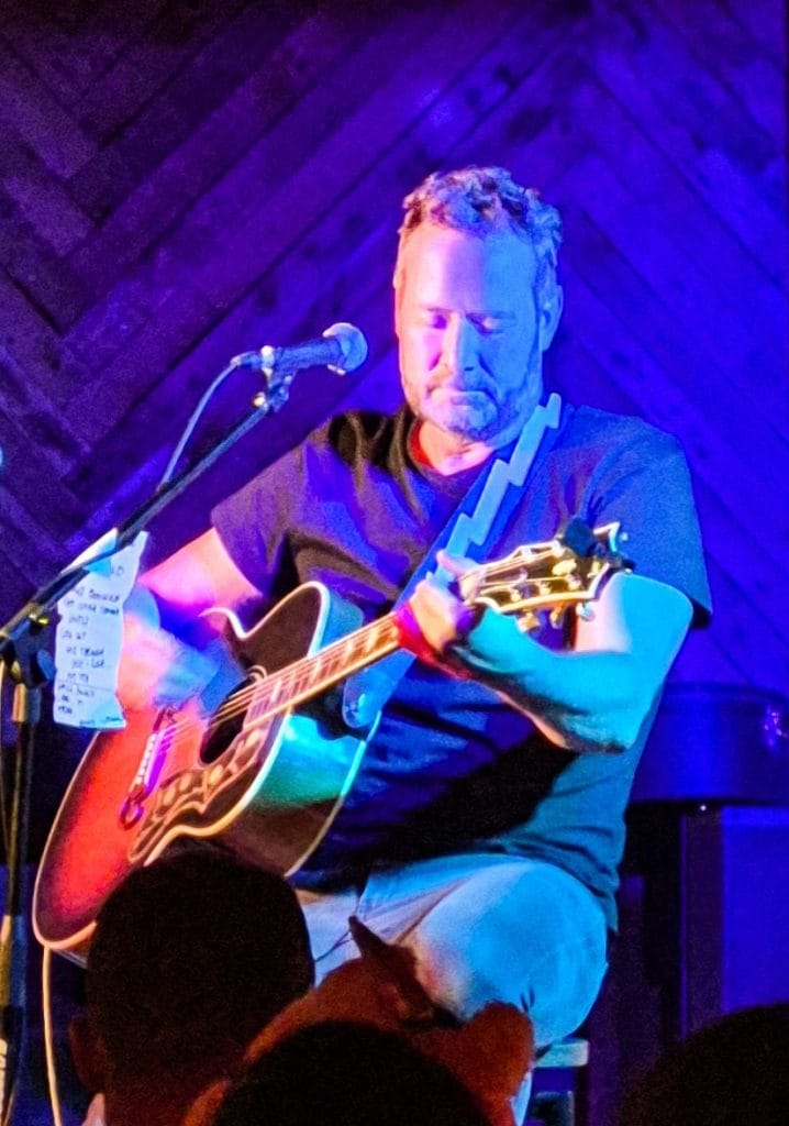
That “trance” thing doesn’t always work, though. Because doing a pub quiz for 80 people (this weekend as well) requires you to be present, in the moment. And when you have to work to find those social skills, you can’t simply zone out and let it wash over you: you need to be there and you need to be larger than life to respond to your audience. I’ve never really struggled with public speaking, because you can zone out a bit on a monologue, but this was very different.
There needs to be character, quick wits and interaction. And so this was hard work for me.
But it went really well. The mind over matter thing was required more in the run-up to the event, and – because it was well- rehearsed, I knew my stuff and had confidence in my questions – it was all fine.
If you’d offered me an escape route 5 minutes before we started, though… I’d still have been very tempted.
As it is, not only do the fundraisers want another quiz already, but the venue that we hired for the evening also want one. The scientist in me wants to agree to both, just to see if next time will be as nerve-wracking (but successful) as this one was.
Look. I’m not sure what the message is here.
I’m not even sure if there is a message.
There’s probably no message here.
You’ve read all this for nothing.
But I do seem to be facing my fears this year for some reason, and at the moment, I’m coming out on top.
Does that mean that I’m less fearful of these things? I don’t think so. But maybe I do feel more comfortable in getting myself over the fear I feel. The fact that I can overcome things that I really wasn’t easily able to face before feels good. That’s got to be a positive, right?
Maybe I can apply it to other areas of my life. Although I maintain that there really is probably no message here.
I’m still not getting back on a horse, though.